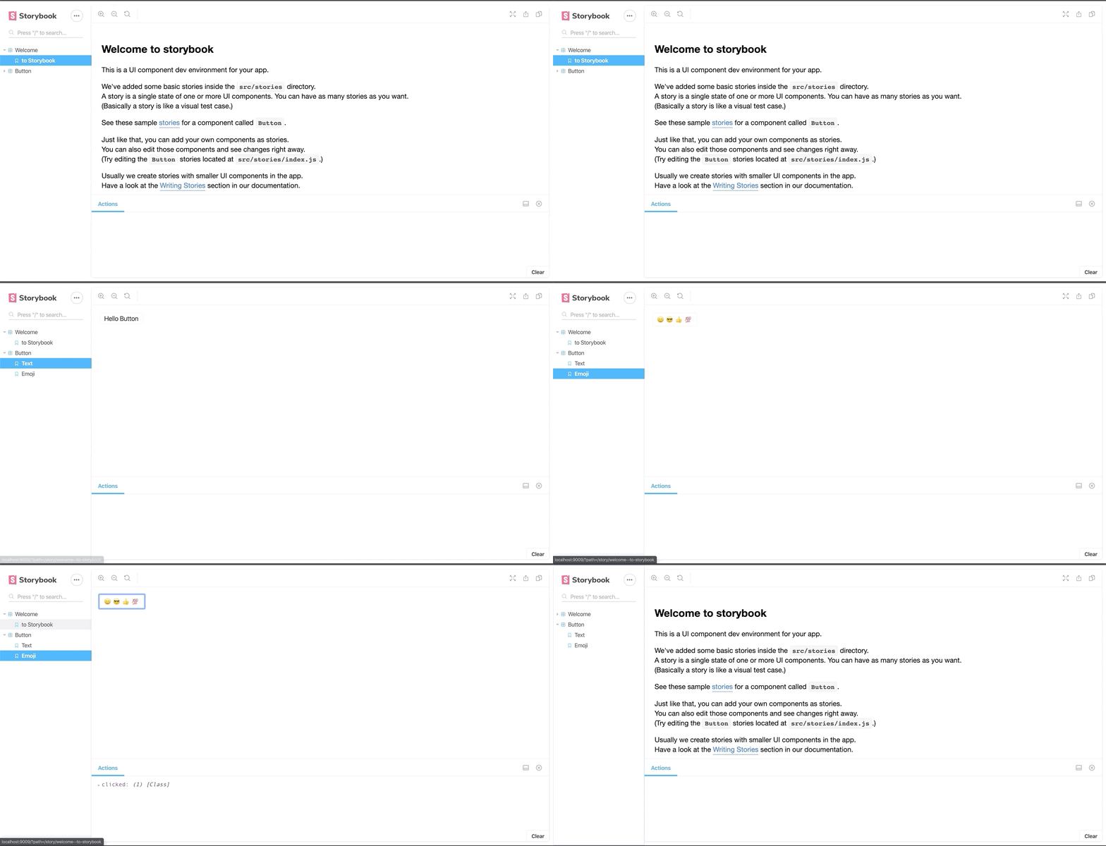
Storybook is a user interface development environment, a playground for UI components. Here’s how to use it
Storybook is a user interface development environment. Or, in simpler terms, it’s a playground for UI components. This tool enables developers to create components independently while showcasing components interactively in an isolated development environment.
Storybook runs outside the main app so users can develop UI components in isolation, without worrying about app-specific dependencies and requirements.
Create and Configure
Personally, I always find it difficult to code by merely following steps from reading content. I like to also have a repository to look at and play with. Here’s an example that’s available and free to use.
This repo includes work from my previous article Components at Scale — Build a Library that Scales.
Storybook supports a lot of add-ons and comes with a flexible API that you can customize as desired. By far the easiest way of setting up Storybook is using the Storybook CLI.
This can detect if you are using React, React-Scripts, and Typescript — then set it up accordingly. In our case, it will install preset-create-react-app, which configures Storybook to reuse CRA’s typescript handling. Awesome!
npx -p @storybook/cli sb init — type react_scripts
This is a huge help. Otherwise, there are quite a few manual steps, which you can view here.
When this command is executed, you’ll be able to run npm run storybook and start Storybook in watch mode.

This is great, but as you can see, it’s reading from the files generated by the storybook CLI tool. We want to remove them and ensure that it only pulls files ending with .stories.tsx from our components directory.
We’ll need more control than the TypeScript preset offers. We want to separate concerns while having the control to add additional add-ons, select where our ./src files come from, and add testing plug-ins for the future.
To do that we will need to set up some additional configuration. In your ./storybook/main.js file, remove what was generated and add the following:
module.exports = {
    addons: ['@storybook/preset-create-react-app'],
};
This is the preset I had mentioned earlier. It uses CRA’s Webpack/Babel configurations so Storybook’s behavior matches your app’s behavior.
Now create a folder called config.ts and add the code below. Creating this is going to give us more control over how we build our Storybook and in the future.
import { configure } from '@storybook/react';

configure(require.context("../src/components", true, /\.stories\.tsx$/), module);
Then add an addon.ts file to finish up our configurations for now.
import '@storybook/addon-actions/register';
import '@storybook/addon-links/register';
Our First Story
How to create your first story
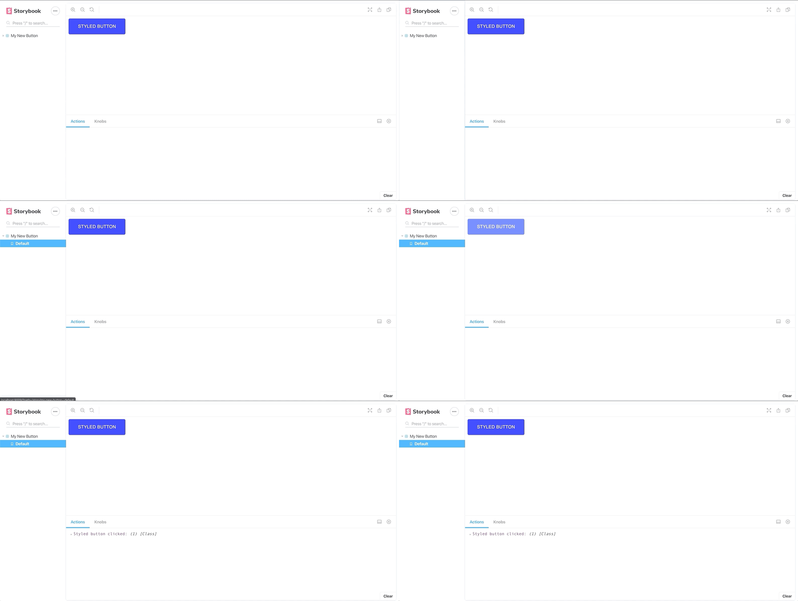
Create a file ./src/components/styled-button.stories.tsx
import React from 'react';
import { action } from '@storybook/addon-actions';
import MyNewButton from '../components/styled-button';
export default {
   title: 'Styled Button',
};
export const Default = () => (
    <MyNewButton onClick={action('Styled button clicked')}>
         Styled Button
    </MyNewButton>
);
Now, and this is important, we need to change the CSS injection order to get styled-components to play nicely with Material UI. This, my friend, is what decorators are for.
A decorator is a way to wrap a story with a common set of components. For example, if you want to wrap a story in some formatting, or provide some context to the story.
To achieve this, we need to add a decorator so go ahead and create a new file called .storybook/styles-decorator.js
.storybook/config.js to include our newly created decorator.MyNewButton now works as expected — hurray!
Setting up Knobs
We already mentioned that one of the great things about Storybook is the ability to include add-ons that extend the tool.
One add-on I particularly like are knobs. Let's take a look.
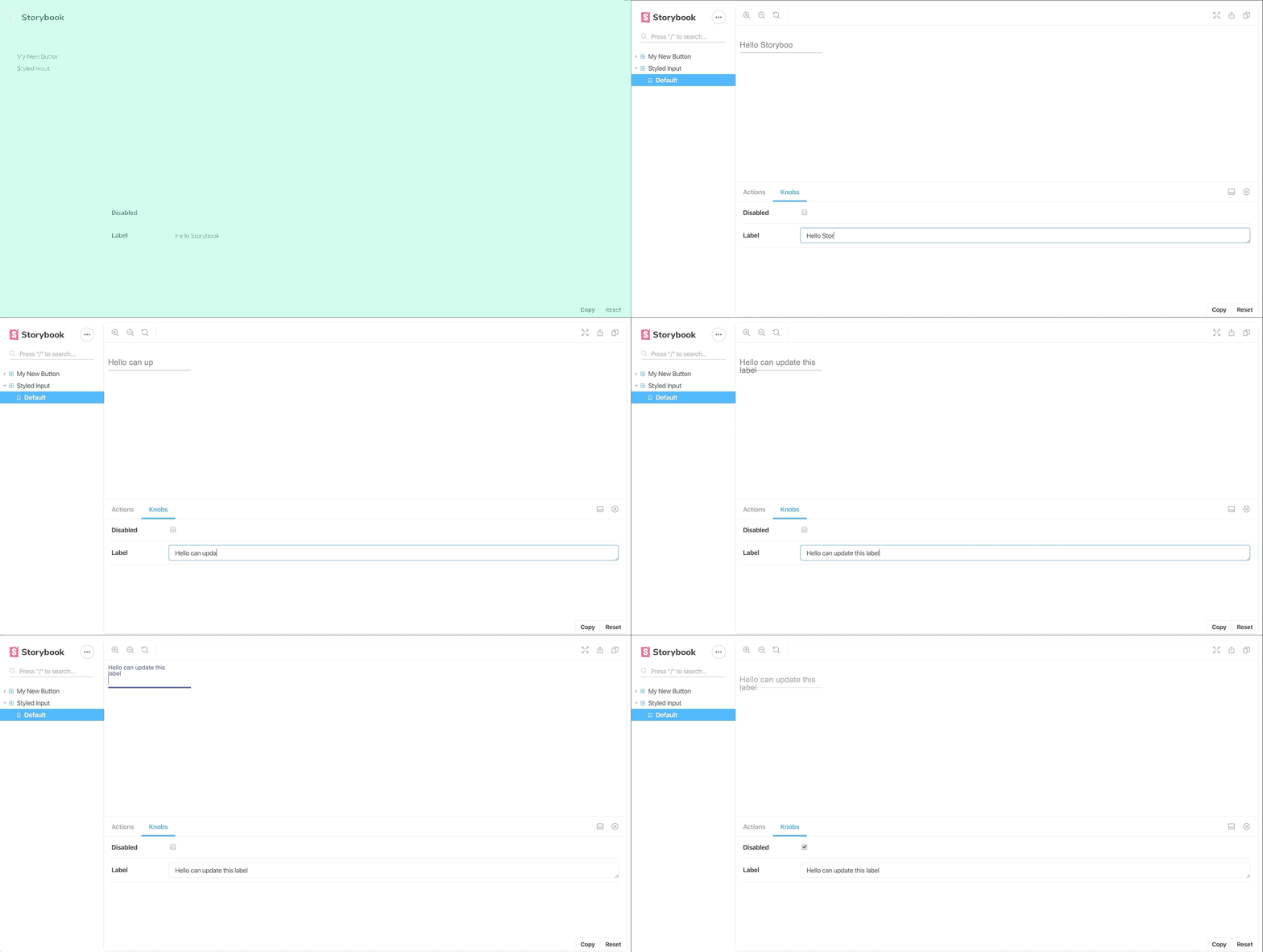
Knobs are a useful resource for designers and developers to experiment and play with components in a controlled environment without the need to code. You essentially provide dynamically defined fields, which allows users to manipulate the props being passed to the components in your stories. Here’s what we’re going to implement:
yarn add @storybook/addon-knobs -dev
Then, configure it as an add-on by adding it to your .storybook/addons.js file.
import '@storybook/addon-actions/register';
import '@storybook/addon-knobs/register';
import '@storybook/addon-links/register';
The order you list these add-ons will dictate the order in which they appear as tabs on your add-on panel.
“How do I use these babies?”
We’re going to go into our components directory and create a directory call inputs, to which we’re going to add a styled-input.tsx:
Then add the following to the stories file:
import React from 'react';
import TextField from './styled-input';

export default {
    title: 'Styled Input',
};

export const Default = () => (
    <TextField></TextField>
);
Great, now we’re able to set up a new component… Let's add some Knobs.
There are a variety of Knobs that you can use. For the sack of this exercise, I'm just going to add a knob that can show me the input field in a disabled state and update the label to contain whatever text I want.
import React from 'react';
import TextField from './styled-input';

import { withKnobs, boolean, text } from '@storybook/addon-knobs';


export default {
    title: 'Styled Input',
    decorators: [withKnobs]
};


export const Default = () => (
    <TextField
        disabled={boolean("Disabled", false)}
        label={text("Label", "Hello Storybook")}
    >
    </TextField>
);
With just the addition of a few things, you can now see that we have a Storybook UI that can be used and updated by other team members quickly and without the need to code. There are many more add-on knobs that you can play around with — they’re all worth taking a look through at https://www.npmjs.com/package/@storybook/addon-knobs.

Conclusion
We’ve only skimmed the surface of Storybook today. But I hope you now have enough resources to go on and play with it yourself. It’s an awesome tool.
I feel that it becomes most effective when we start introducing tests that can work alongside these components and add-ons — where developers can work on one single UI that operates across multiple products.
Further Reading
If you’d like to continue to read more on scaling your components, this piece is only one of a series where we take a look at the tools and processes I've used to build components at scale.
Components at Scale — Build a Library that Scales
Components at Scale — Deciding on a Style System


Leave a comment