Greetings.
At this point, it feels safe to say component-based design and development is here to stay. Gone are the days of designing and building pages in isolation. Instead, we’re building collections of components that all follow a shared design system and can be used across any application.
We’re achieving this with the help of UI development environments, by which I will refer to in this piece as component playgrounds — the most important tool to emerge from this paradigm. Component playgrounds allow us to build, test, and browse our components in isolation. When executed correctly, they make prototyping new experiences both easy and fast, thanks to the consistency they create.
OK, so you're sold on the idea of creating a component playground, your team is growing fast, and you’ve got multiple repos. You’re in need of a single, consistent source of truth or else you risk diverging the repos even further.
How Do We Go About It?
Well, we need a component-development environment where we can build, use, and test the components while keeping a library and documentation around all the built components. There are a few great examples out there, and for the sake of this piece, I’ve researched three of the top-performing ones.
Storybook | ☆ 44.5k
Storybook is a UI-development environment that allows you to visualize different states of your UI components and develop them interactively.
Notably, it offers the ability to toggle between user-specified component stories (i.e., states). The reason for that is because Storybook comes with a lot of add-ons for component design, documentation, testing, and much more.
As an example, you can play with your component props easily by using the Storybook Knobs add-on, which you can read more about here: “Components at Scale — Implementing Storybook.”

Key points
- Interactive documentation for your UI components — how it looks with different properties
- Snapshot unit testing (add-on) — it can automatically generate snapshot testing with all your component stories using Jest
- It helps developers focus on component development by defining the component’s use case in the form of a story
- Its usefulness can be extended using add-ons. For example, you can add additional unit-test code into a related story.
React Styleguidist | ☆ 8.2k
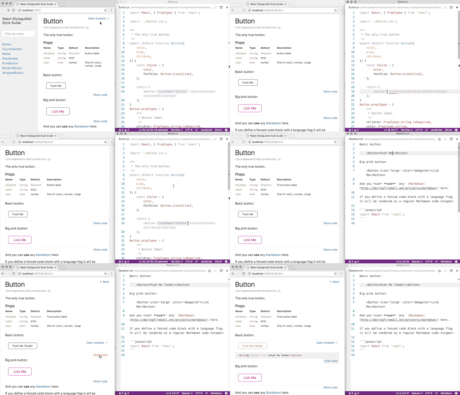
React Styleguidist is a style-guide generator for components. It helps you render components in different states, document them in markdown, and export that as a static site. It lists component prototypes and shows live, editable usage examples based on Markdown files, and it works with CRA out of the box.
What's the biggest difference between this and Storybook?
Not a whole lot, really.
With Storybook, you’re able to write stories in JavaScript files. With React Styleguidist you can write examples in Markdown files.
Storybook is great for showcasing a component’s state and running tests, while React Styleguidist is useful for documentation and demos for different components.

Bit | ☆ 9.7k
Now, you’ve viewed two of the top free component playgrounds to use. However, let’s say you’re feeling flus,h and you’re happy to spend $12/user on something that may simplify and improve your processes even further. Bit offers a free option for personal accounts if you’re interested in trying it out.
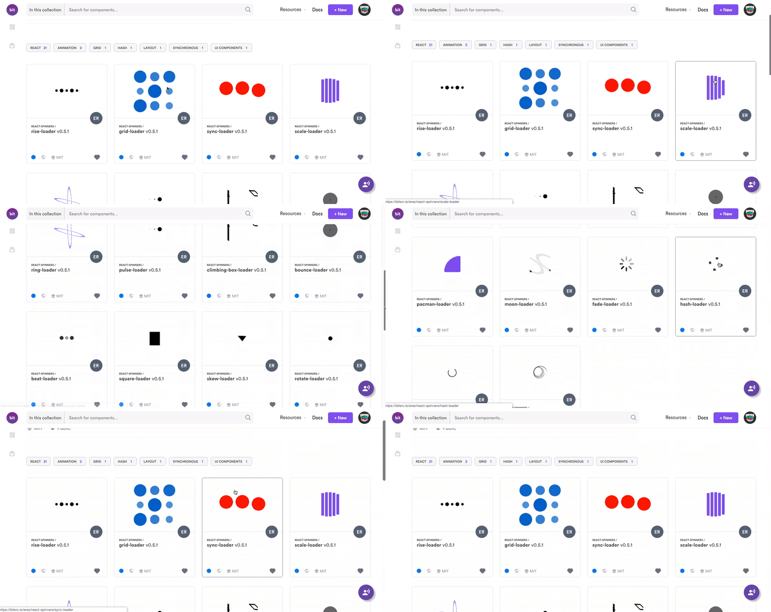
Bit performs similar stuff to the two playgrounds we’ve mentioned earlier. On top of the standard offerings, it also acts as a component library. It’s an open-source tool that allows you to encapsulate components with all their files and dependencies while running them across different applications.
Bit’s landscape provides a free cloud-based hub called bit.dev. The components you share to bit.dev become discoverable in your team’s shared component hub, making it easy to share and manage components between projects and apps at any scale. Bit’s CLI tool is an open-source tool that pulls components from their repositories, allowing you to build and use them independently anywhere. The bit.dev platform lets teams organize, manage, and collaborate over shared components without any limitations.

So Which One Did I Choose?
I personally like Storybook. Its star rating on GitHub indicates that I'm not the only one who shares this opinion. As one of the most popular options out there, it does offer a lot of great add-ons.
Knowing that, I’m able to scale it further in the future if needed — for instance, adding a testing suite. Over time, I’ve gained experience with it. Therefore, the learning curve will be slightly less. I believe it has all the good bits I need in a library UI, and if it doesn’t, it's flexible enough for the team to add them.
However, I do believe in the right tool for the right job. Before making a decision, I’d encourage you to think about the unique problem you want such a system to solve for your team.
Read more
If you’d like to read more about scaling your components, this piece is only one of a series where I looked at the tools and processes I’ve used to build components at scale.

Leave a comment